Podcast: Play in new window | Download
Subscribe: Spotify | Email | TuneIn | RSS
Scientific conferences are a great way to meet other scientists and share your research. Perhaps your advisor got lucky and was invited to give a talk. If your research doesn’t get time on stage, how can you make connections and tell others about your project?
The poster session is your ticket to fame and glory. Nearly anyone – from tenured faculty to summer undergraduate – can submit a proposal and tack up a poster.
That unlocks a world of opportunity to share your science, meet like minds, and network your way to a new project, job opportunity, or collaboration.
But creating a poster is more than simply clicking ‘Print’ on a few figures. Crafting your story takes planning, and we’re here to help with advice from real-live poster presenters!
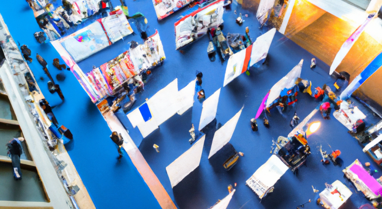
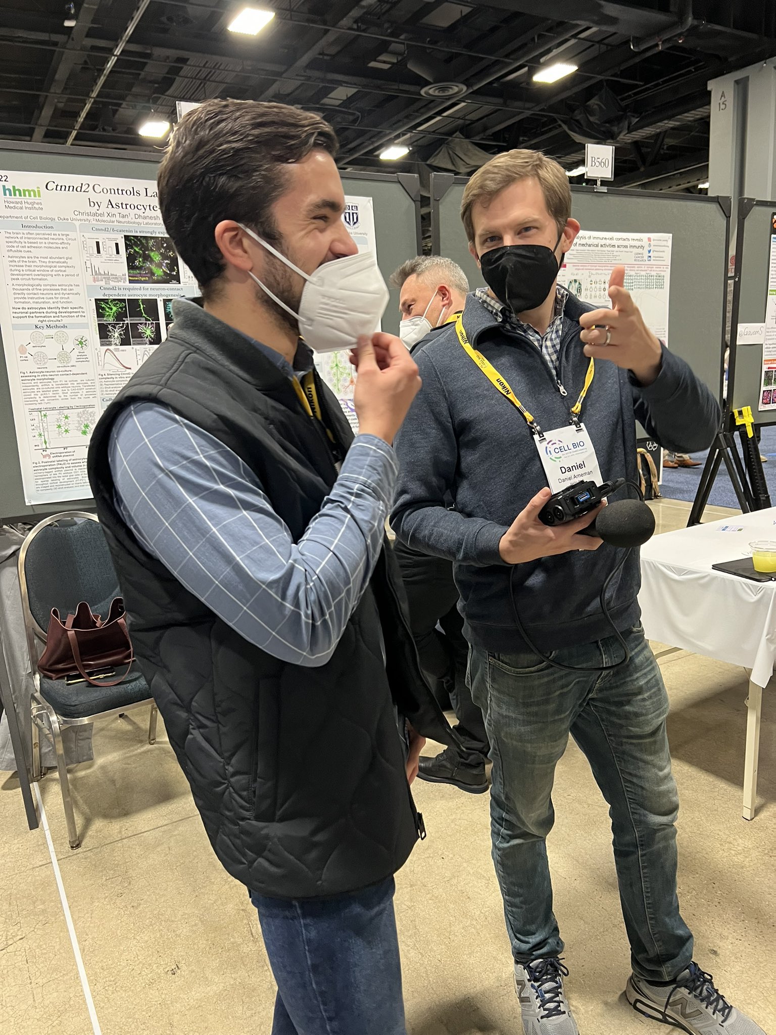
Josh and Dan attended the American Society for Cell Biology’s Cell Bio 2022 conference in Washington, DC. It was a great opportunity to chat with scientists about their work, and life in the lab.
During the poster session, we interviewed some presenters – not about their research – but about how they approached the poster presentation itself.
Their advice is a great introduction to anyone wanting to create their own poster!
Seeing the Structure
Before you start choosing your favorite figures or writing an introduction, you need to give some thought to your poster’s format and layout.
Deborah recommends paying careful attention to the poster dimensions dictated by the conference organizers. She made her entire poster before realizing the sizes she chose wouldn’t work.
I waited until 10:00 PM before I checked and I realized I needed to make these dimensions different, therefore I had to start all over from scratch. So don’t make my mistake!
Sarah from Oglethorpe University used a creative approach to reduce the printing cost and to make transport much easier.
It will cost you less to be able to print it in sections. So instead of having a big 44″ by 40″, you can cut it in half and have it be printed for free, potentially at your University. And that’s what I did with my poster, chopped it up into two sections, and then on my board I pinned it together and it looks great.
Omar thinks about his poster design in sections, as if they were a series of individual figures or statements.
I “grew up” in the era where when you made posters, each panel was an individual 8 1/2″ by 11″ piece of paper, and I’ve essentially kept that organization for large poster printing. Design it in a way where if you are only reading the section headings, you get the gist of the whole story. So in a sense they’re sort of like topic sentences, but the entire set of section headings on their own tells the full story, and then you can fill in the details later.
Make It Visual
While you want enough text to help a viewer understand the story if you’re not standing right next to your poster, it shouldn’t be a wall of 10pt text. Posters are a visual format, so make your images vibrant and compelling.
Leia recommends making your own images, rather than cobbling them together from various sources.
My greatest advice to anyone trying to make a poster is to make your own figures and to spend a lot of time on them. That way they look great. Nobody wants to walk past a poster that’s busy or that has different styles of of graphics. You want everything to look like it came from the same source
Several presenters recommended crafting images in a tool called Biorender. It allows you to create custom scientific illustrations using high-quality graphics of scientific concepts. You can paste a cell wall, resize it, add some transmembrane proteins, and drop on a virus particle. Everything looks professional because it’s all drawn in the same style.
QR Codes Enhance the Experience
Many presenters were extending and enhancing their static posters with QR codes linking to additional content.
Phil is using them to help people connect with him online.
Make sure you’ve got a QR code on your poster because that helps people to find your you later on.
Not everyone will carry a pencil and paper to jot down your email address, but everyone has a phone. Use it to your advantage.
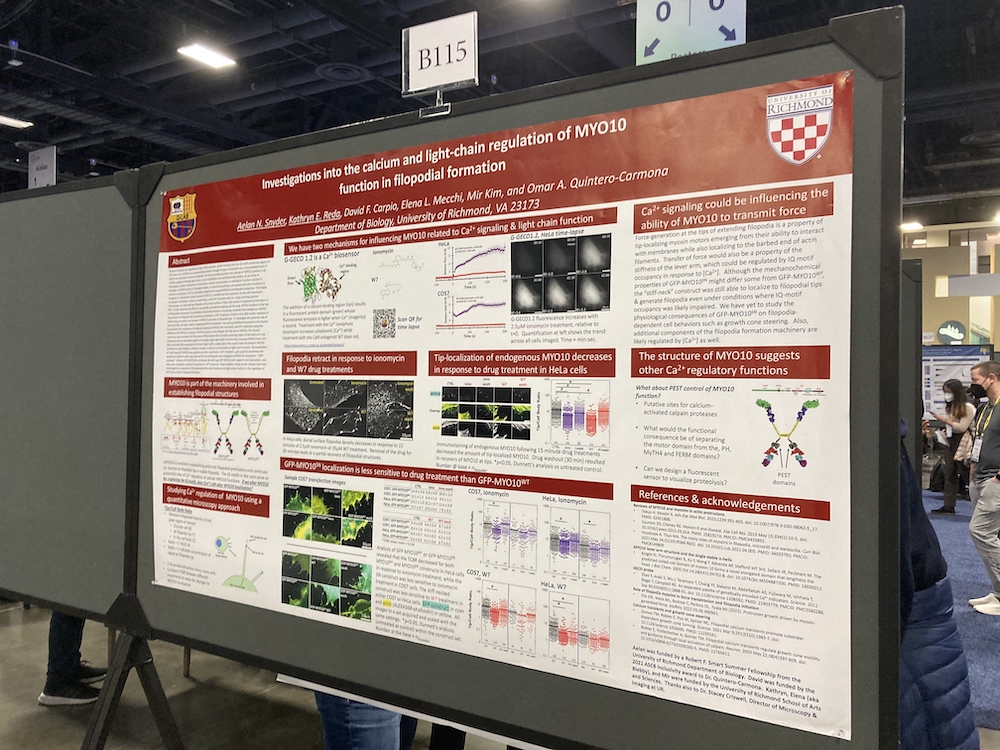
David from the University of Richmond uses the codes to show off the multimedia content that can’t fit on his static poster.
For our poster we have live imaging cells and we wanted to be able to display that – the images and videos that we took. So we used QR codes and placed them in the middle of our poster and you’re able to scan it with the camera. And once that’s done, you can go into a Google Drive that contains the video of the live image cells and play them and replay them.
Tell A Story
Last, but not least, several presenters recommend thinking deeply about the story you’re trying to tell before putting anything on the page. Having a narrative in mind will let you decide which experiments to show, and which to save for another day.
Augustin from the University of Toledo sums it up nicely:
One key piece of advice when making a poster is: think of the story you want to say and try to strip it down from unnecessary information. Whenever I start doing a poster, I might end up having a lot of information there, but you want to be concise so you don’t overwhelm your spectator.
We share many more tips and ideas for creating YOUR scientific poster in this week’s episode. If you have ideas, why not share them with us? Email us at podcast@hellophd.com to join the conversation!